Decoding Nykaa: A Power BI Dashboard

Have you ever wondered how big e-commerce platforms like Nykaa decide which brands to promote, which products to discount, and which brands are running low on stock?
The answer actually lies in dashboards - like the one we're breaking down today.
In this blog, we'll walk through a complete Power BI dashboard built on Nykaa's brand and product data. We'll uncover the problem it solves, see how the raw data was cleaned and prepared behind the scenes, and break down the business insights hiding in each chart.
📺 Watch the full step-by-step tutorial here:
The Problem Statement
Nykaa lists 25 brands and hundreds of products across various categories, each with different prices, discounts, ratings, and stock levels. But without a centralized view, it becomes very difficult for a business team to answer simple but critical questions like:
- Which brands are the most trusted (highest rated) by customers?
- Which brands are being discounted the most, and is that hurting or helping sales?
- Which brands are running out of stock and might need reordering?
- Are premium (expensive) brands also the best performing ones?
This dashboard was built to solve exactly that: give a single-page, visual answer to "how is each brand performing on Nykaa?", so business teams don't have to dig through spreadsheets to find out.
Why This Kind Of Analysis Matters For Businesses?
Brand-level data might look like just numbers on a screen, but for any e-commerce or retail business, it directly shapes some of the biggest decisions on the ground:
Inventory Planning
Knowing which brands are low on stock helps avoid missed sales.
Pricing Strategy
Comparing average prices across brands helps identify premium vs. budget positioning.
Marketing Spend
High-rated, high-demand brands are safer bets for ad spend and homepage placement.
Discount Strategy
Discounting too much can hurt margins; discounting too little can hurt visibility. This shows which brands are discount-heavy.
The Data Storytelling Process
Good dashboards don't just show numbers - they tell a story.
1. Know your audience before you know your chart
A business team wants decisions, not statistics. Before picking a single visual, ask: who is looking at this, and what do they need to walk away knowing? A category manager cares about stock, while marketing cares about ratings.
2. Lead with the insight, not the data
Good storytelling puts the "so what" right next to the "what," like calling out directly that "Lakme is the highest-rated brand" instead of expecting viewers to spot it themselves.
3. Structure the narrative like a story, not a spreadsheet
A dashboard should have a flow - starting with the big picture (total brands, average rating), moving into deeper comparisons, and ending with a takeaway.
Chart-By-Chart Insights
Every chart on this dashboard is hiding a small business decision. Let's dig them out one by one.
1. Key Metric Cards
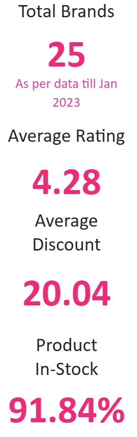
Insight: Nykaa hosts 25 brands with a strong average rating of 4.28 out of 5, an average discount of ~20%, and a healthy 91.84% stock availability.
Business Impact: These four numbers together act as a quick health check. A high rating tells the business customers are largely satisfied, ~20% discount protects margins, and 91.84% availability means few hit a "sold out" wall.
2. Brand-wise Ratings Count
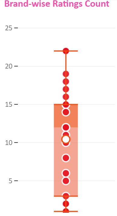
Insight: Most brands have their rating counts clustered between 5 and 15, with a few outliers going as high as 22, showing uneven customer engagement across brands.
Business Impact: Brands with very low rating counts may need more visibility or marketing push to build customer trust and reviews.
3. Brand Rating Insights
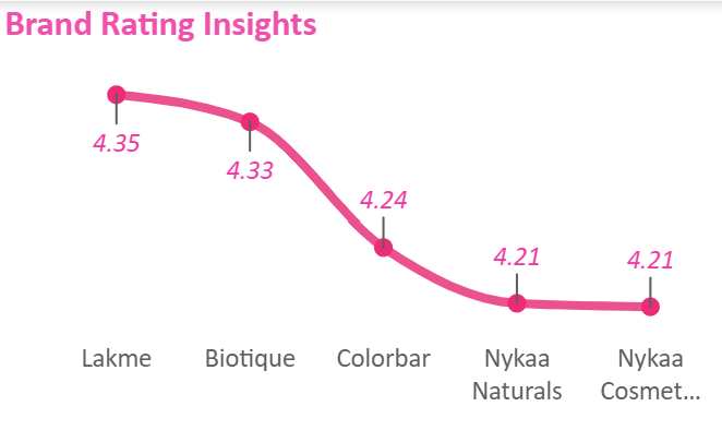
Insight: Lakme leads with a 4.35 rating, followed closely by Biotique (4.33), while Colorbar, Nykaa Naturals, and Nykaa Cosmetics settle around 4.2-4.24.
Business Impact: With almost every top brand rated above 4.2, Nykaa's quality control is clearly strong. Lakme and Biotique are the safest picks for trust-building campaigns.
4. Tag Distribution Across Products
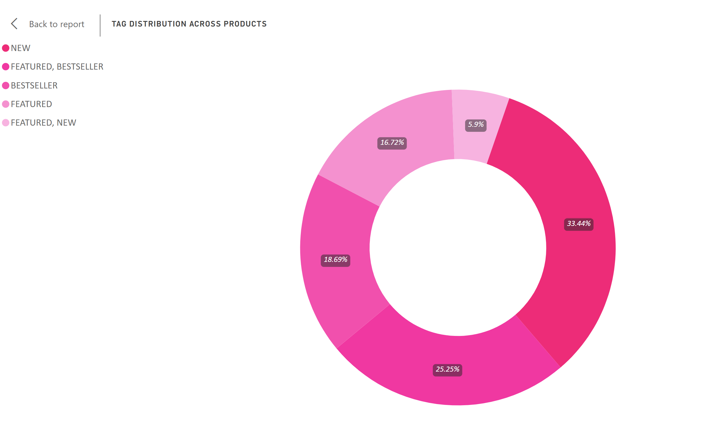
Insight: "New" products make up the largest single share at 33.44%, followed by products tagged both "Featured, Bestseller" (25.25%).
Business Impact: With a third of the catalog freshly tagged "New," Nykaa is clearly prioritizing constant product rotation over relying purely on old favorites.
Overall Business Takeaway
When you connect the dots across these charts, one story stands out:
Nykaa Cosmetics emerges as the platform's strongest in-house brand, with high stock, strong catalog presence, and solid ratings, while Lakme holds the crown for customer satisfaction, and Kayali anchors the luxury segment.
This single dashboard view helps decision-makers instantly spot which brands to promote, restock, or reconsider pricing on, without opening a single spreadsheet.
Actionable Recommendations
- Prioritize Nykaa Cosmetics and Nykaa Naturals in promotions, since they have the best stock availability and strong ratings.
- Investigate high-discount brands like Moi to check if the 50% discount is a growth strategy or a sign of overstock.
- Use Lakme as a trust-building anchor brand in homepage banners, given its top rating of 4.35.
Platform Health:
4.28
Average Rating
Across all 25 top brands, customer satisfaction remains exceptionally high.
91.8%
In-Stock Rate
A very healthy availability metric, minimizing revenue loss from out-of-stock items.
~20%
Average Discount
A balanced discounting strategy that protects margins while incentivizing purchases.